

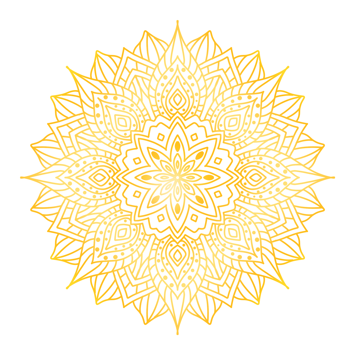
Traditional Color Mandala (Supplementary Course)
The Traditional Color Mandala course focuses on the psychological impact of color and self-expression. Through the process of color selection and filling, individuals are guided to recognize their current emotions, release internal tensions, and rebuild a sense of psychological order and aesthetic experience. The course integrates art psychology and color symbolism to help you express unspoken feelings through color.
▲ AI interaction: Please describe the color you desire at the moment and what it represents?
Click the button below to participate in a color association exercise with AI to explore your current emotional state and color preferences.
2. The symbolic function of traditional colors in psychology
- red:Vitality, courage, anger, vitality
- blue:Stability, trust, melancholy, calmness
- yellow:Hope, light, anxiety, attention
- green:Balance, Growth, Healing, Compromise
- Purple:Mystical, spiritual, introspective
- Black/Gray:Boundaries, retreat, and self-protection
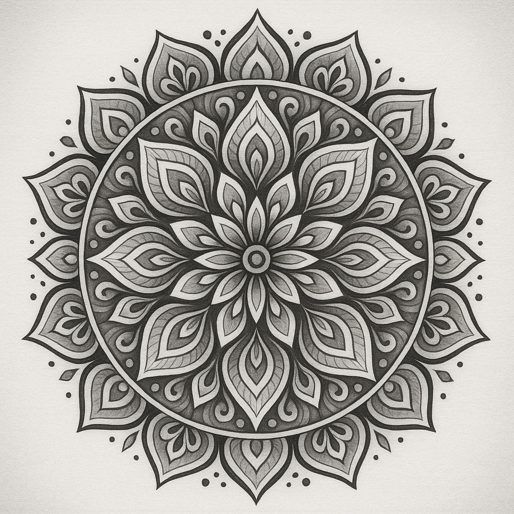
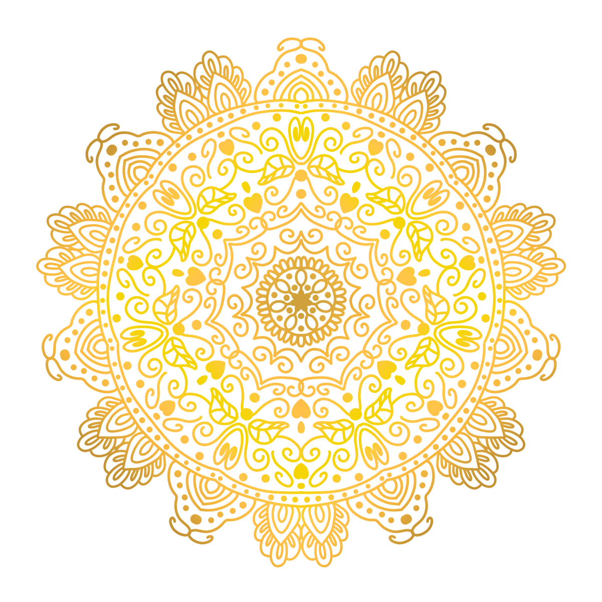
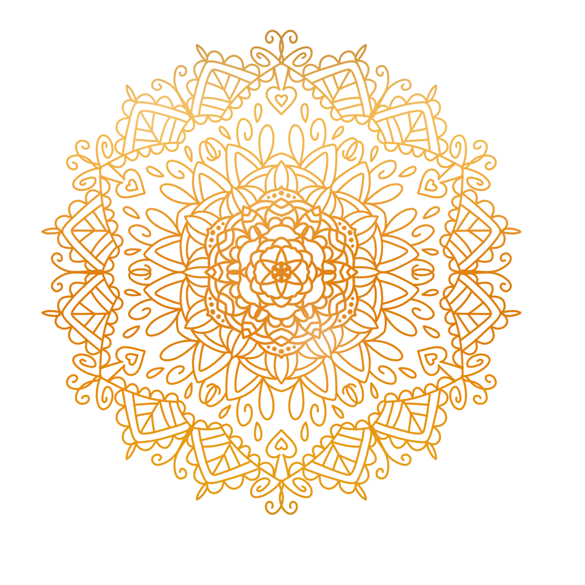
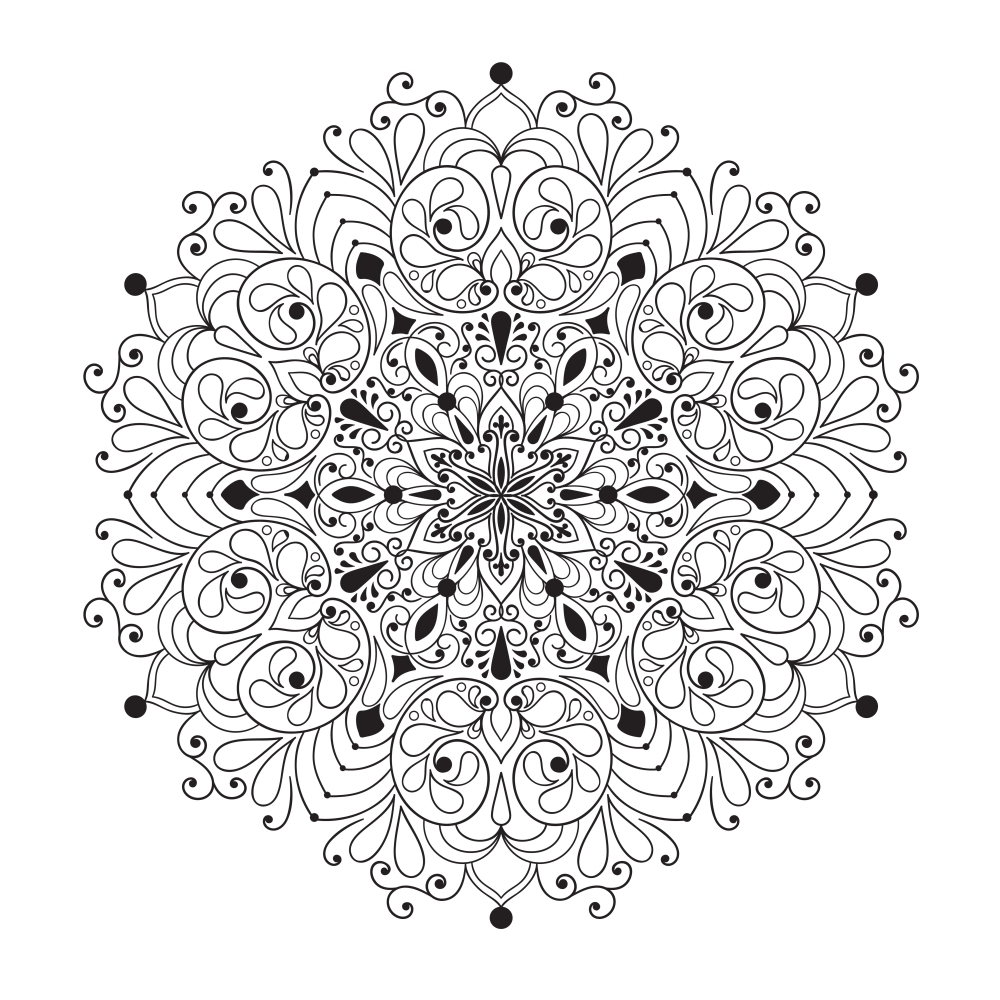
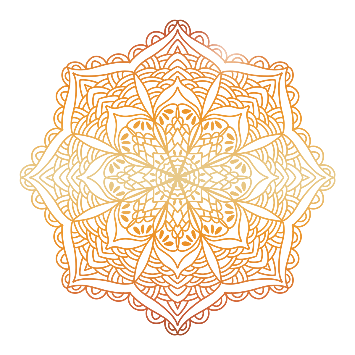
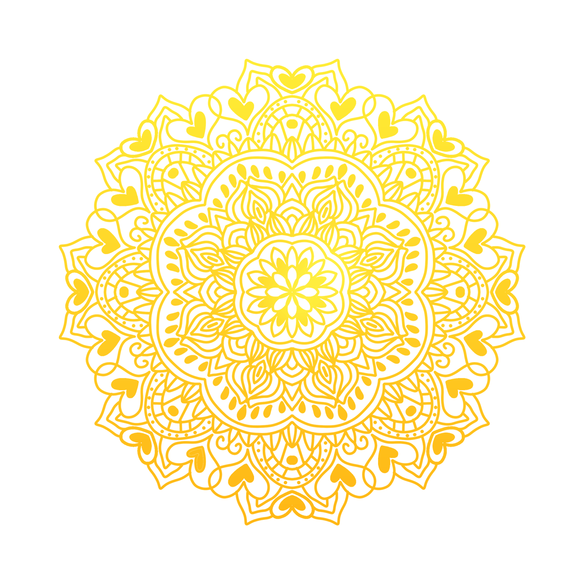
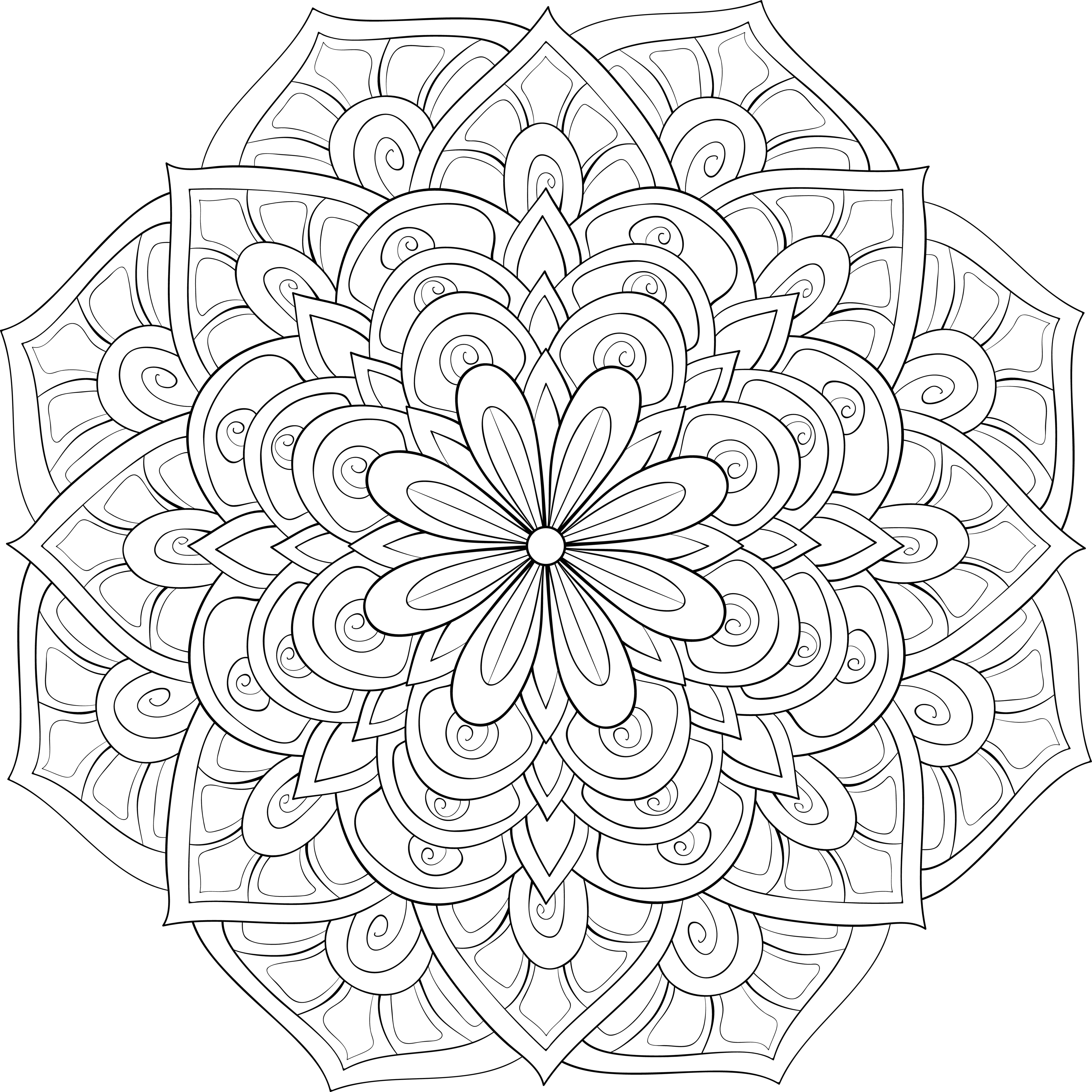
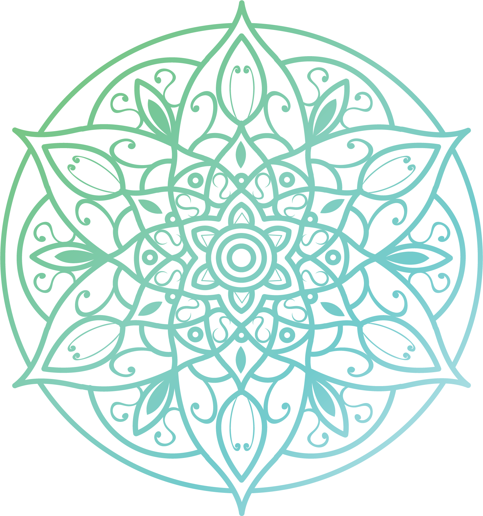
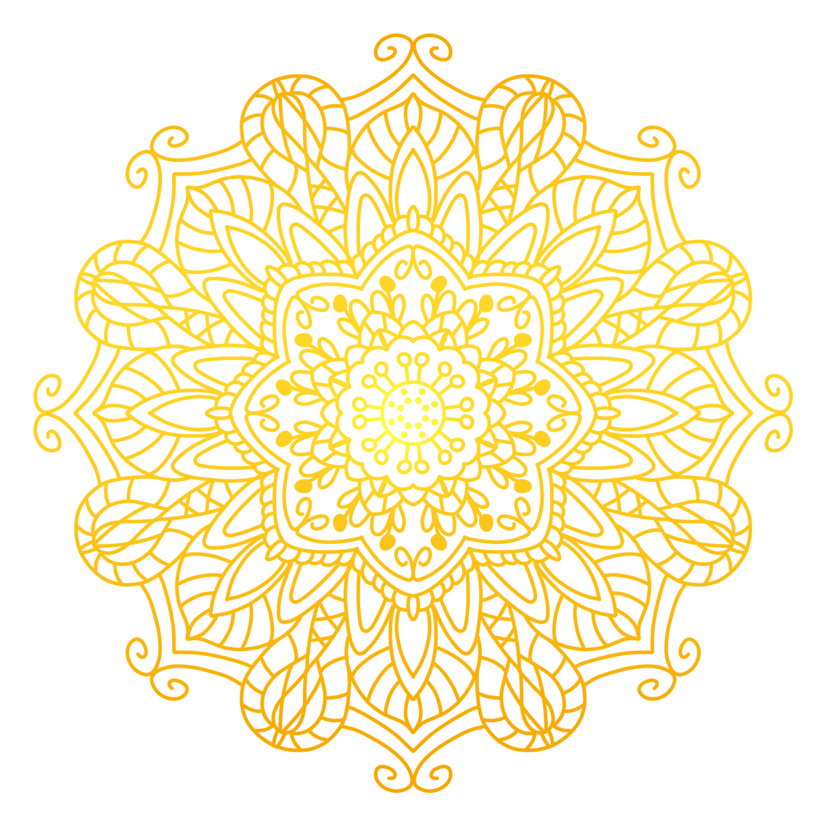
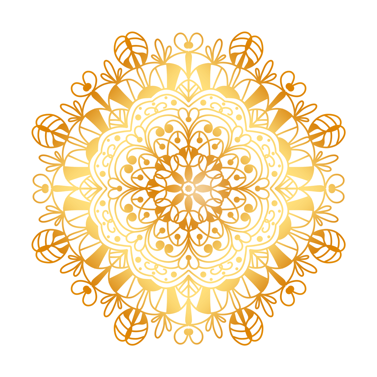
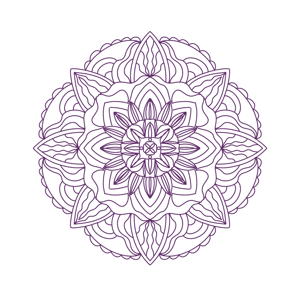
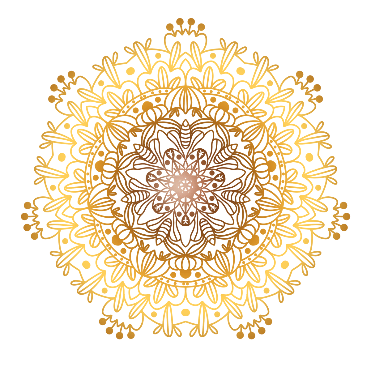
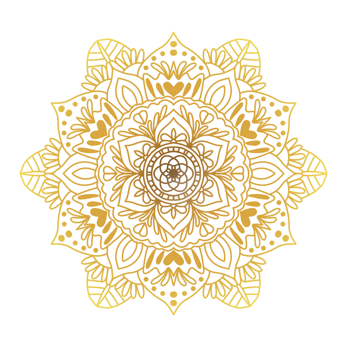
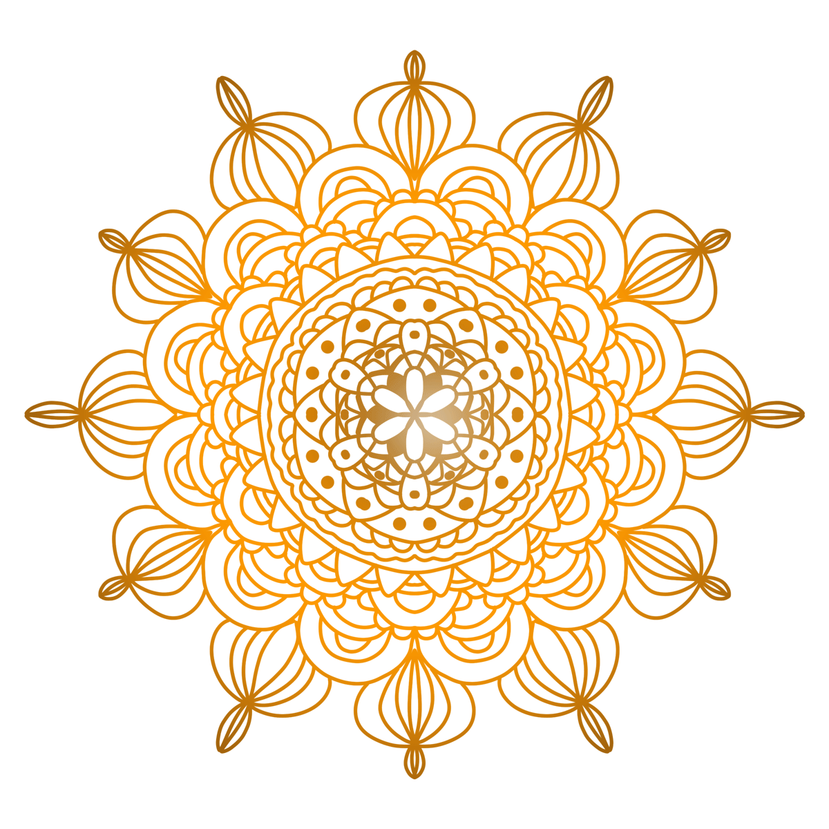
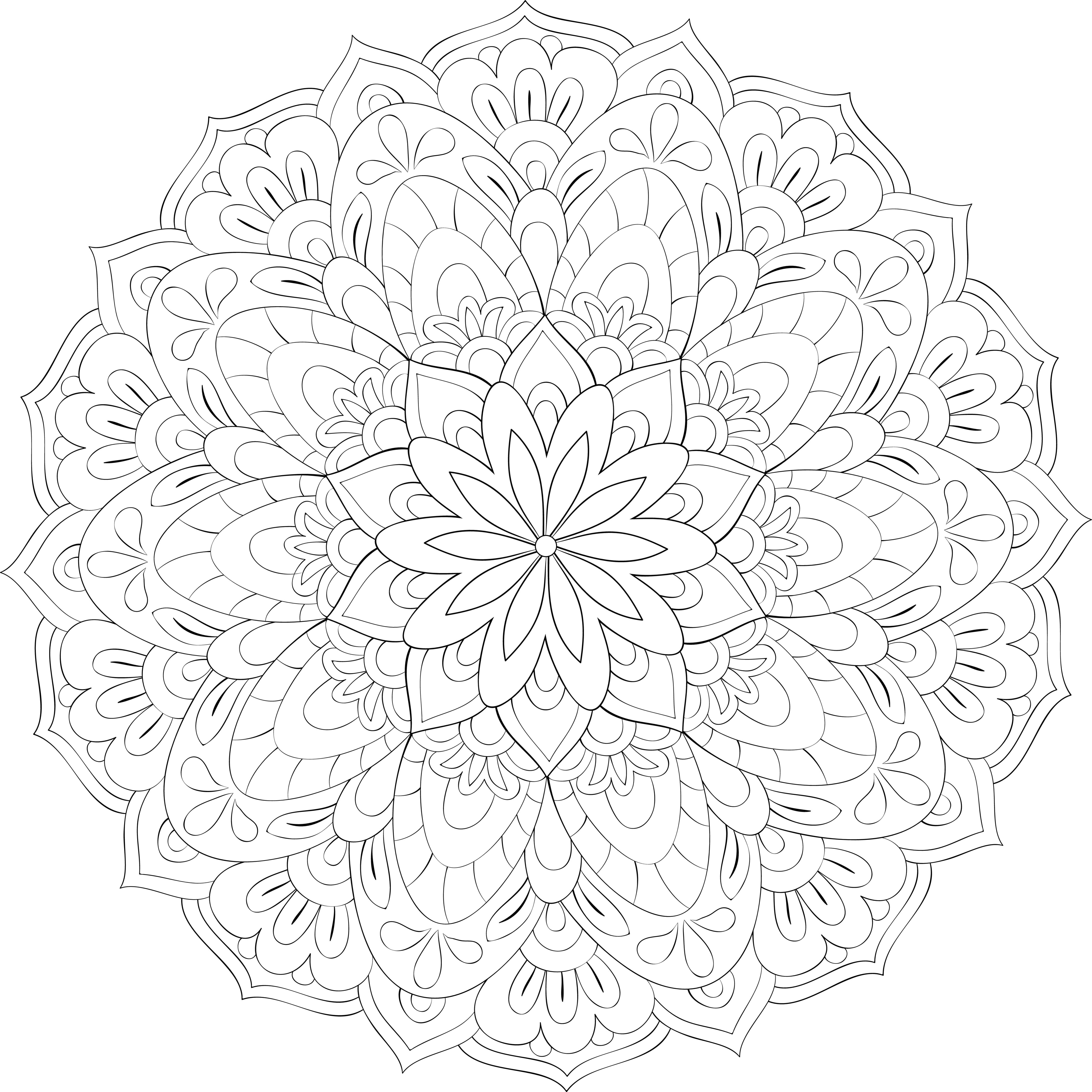
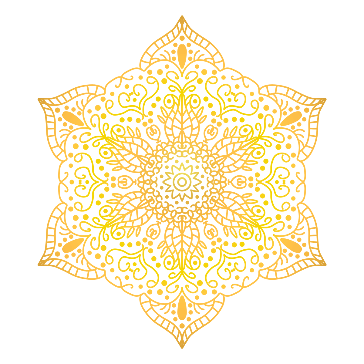
○ The healing power of traditional color mandalas: drawing guidance and suggestions
This course uses traditional colors as a medium for emotional regulation. Through circular and radially symmetrical mandala structures, students practice steadying their breathing, focusing their attention, and gently expressing their inner selves. Emphasis is placed on developing a personal color palette, rhythmic coloring, and visual anchoring of symbolic meaning.
1. Personal Traditional Color Chart Cards (Color Names-Emotional Connections)
- Draw 6–8 color blocks on one side of the paper and write down traditional color names and associated words, such as: ochre (grounded), rouge (warm), ultramarine (serene), indigo (calm), beige (soft), and cinnabar (invigorating).
- Label each color block with its “Purpose”: Soothing/Uplifting/Transitional.
- Select 1-2 main colors and 1-2 secondary colors for the day, mark them with asterisks, and use them as the core of this coloring.
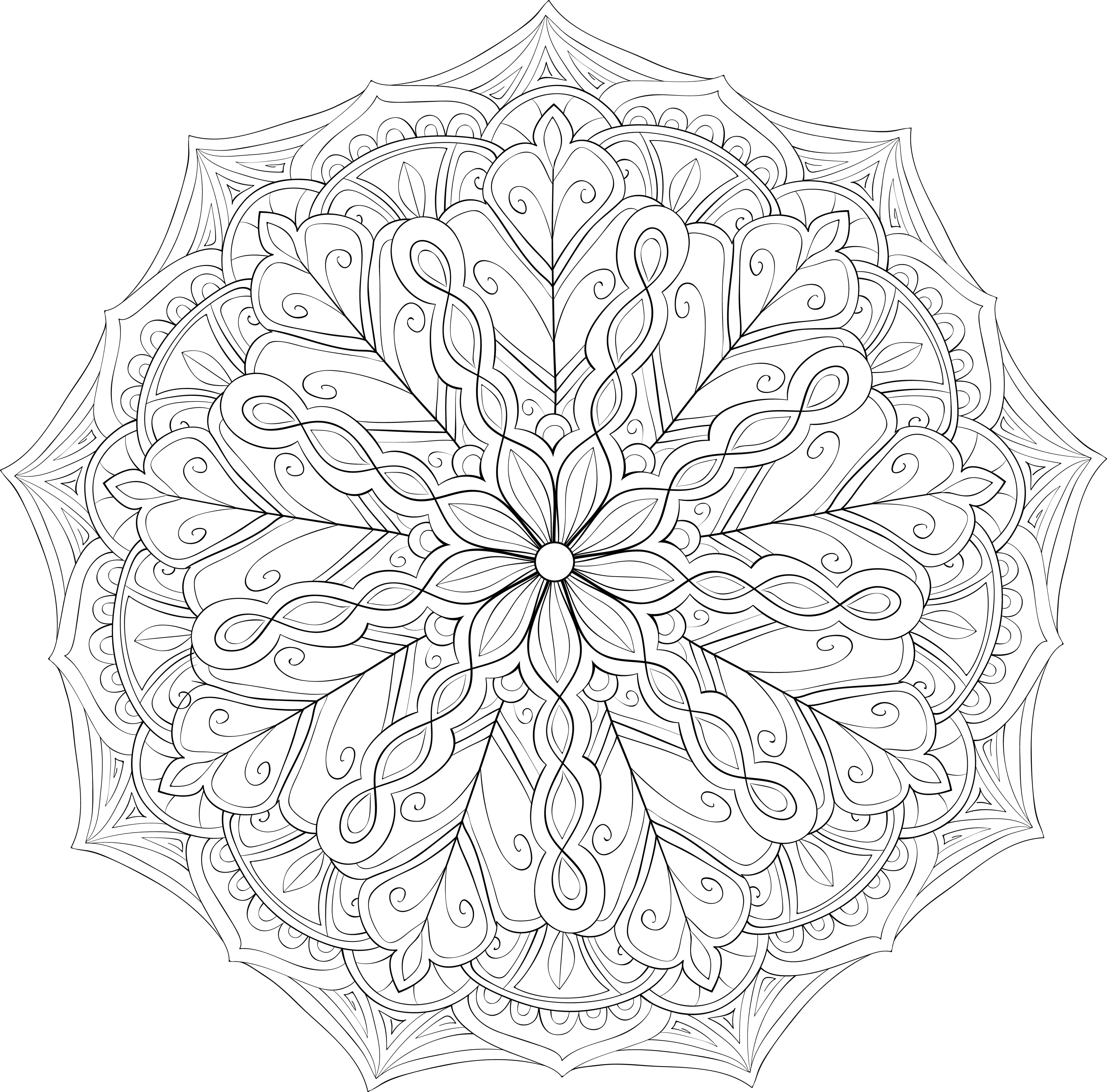
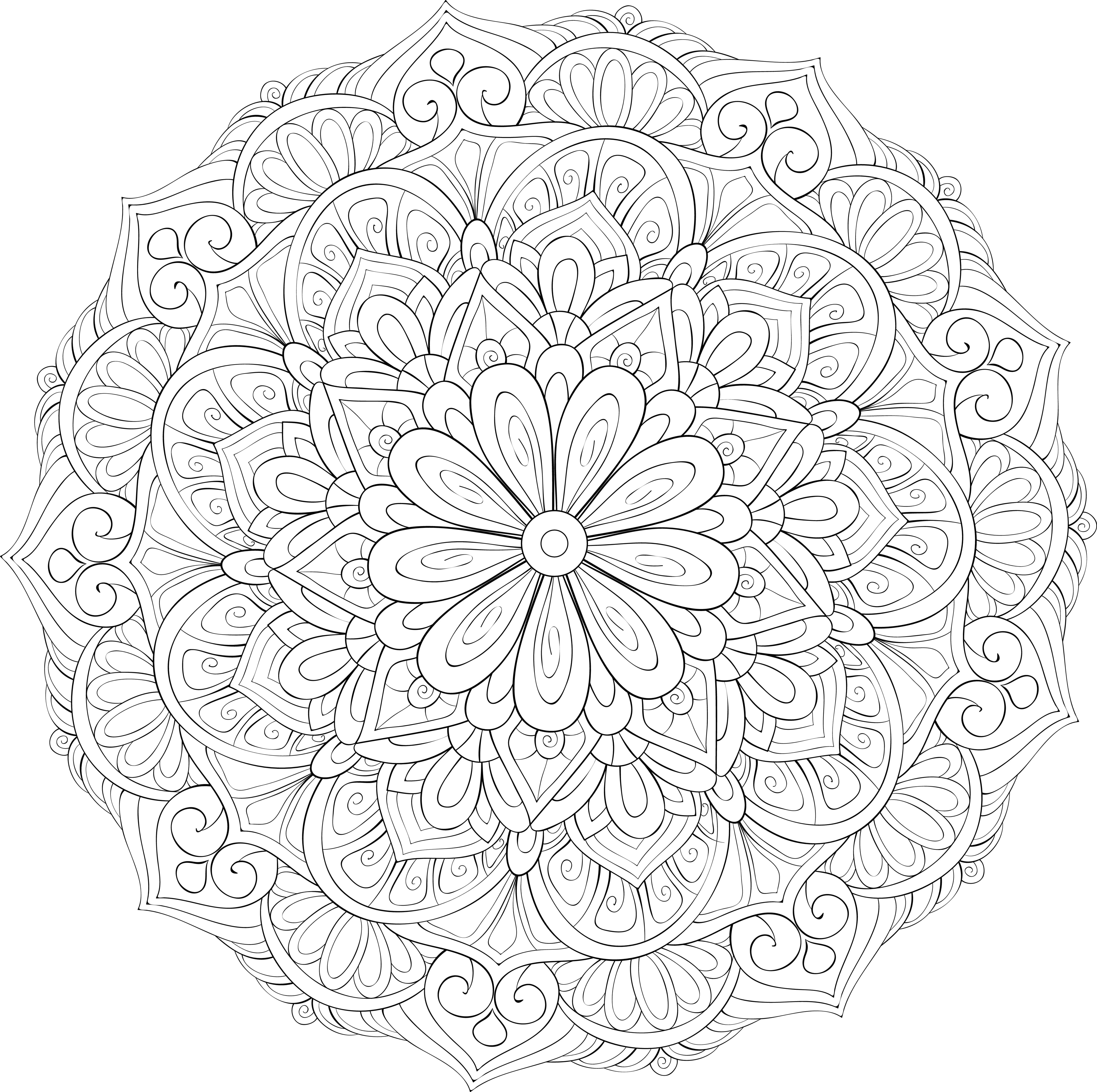
2. Center-Ring Structure (Breathing and Rhythm)
- Starting from the center of the circle, draw 3–5 concentric rings, dividing each ring into equal sectors.
- Practice the rhythm of "coloring - exhaling - pause - inhaling": one sector per breathing cycle, keeping the brushstrokes slow and even.
- The center uses "tranquil colors" (such as ultramarine and indigo), and the outer ring gradually transitions to "warm colors" (such as ochre, rouge, and cinnabar).
3. Warmth and Brightness Gradients (Emotional Temperature Regulation)
- Draw a "cold-warm" axis on the left and a "light-dark" axis on the right to determine the temperature and brightness range of this color scheme.
- When tension is high, choose cool colors and low saturation; when fatigue is low, choose warm colors and medium saturation.
- Use arrows to indicate the gradient direction from the center to the outer ring: from dark to light or from light to dark, to avoid visual burden caused by high contrast.
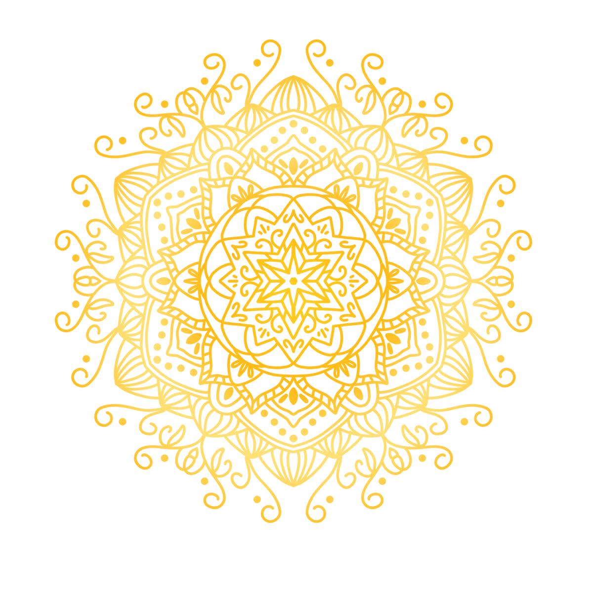
4. Traditional pattern elements (symbolic anchoring)
- Add simplified traditional elements to the second or third circle: cloud patterns, spiral patterns, lotus petals, geometric diamonds, etc. Choose patterns with simple lines, repetitive patterns that are easy to use.
- Give each element a label of "inner meaning", such as "reed pattern = continuity" and "lotus petals = nourishment".
- Maintain the principle of "repetition-micro-change": similar shapes are placed next to each other, and colors change slightly to help stabilize attention and avoid boredom.
5. 30-Minute Immersion Process (Timing and Review)
It is recommended to take 30 minutes as a session and follow the steps below:
- Minutes 1-5: Choose primary/secondary colors, complete concentric circles and equal divisions.
- Minutes 6-20: Color according to the rhythm of your breathing, gradually moving from the center to the outside.
- Minutes 21-30: Add pattern elements and small gradients, and fine-tune the overall look.
6. Review and Summary (three lines)
Please write in the blank space on your drawing:
- The main and secondary colors are: ______ / ______, and the feeling they give me is: ______
- The pattern element I use most often is: ______, which represents: ______
- After completing this, my emotional temperature changed from: ______/10 to: ______/10
Tip: Traditional colors and repetitive structures can help with focus and stability. If you experience noticeable dizziness, excessive tension, or emotional fluctuations, please pause the practice, adjust your posture and lighting, and seek professional support if necessary.
Please log in before submitting your drawings and feelings.